|
|
Post by Dragge on Dec 26, 2008 23:13:28 GMT -5
To tell you the truth fAB it's not in crayon it's actually in colored pencil. I can see why you thought it was crayon. It truley does look that way. It wasn't scanned either. I took a picture with my digital camera(an old one that uses floppy disks). I took the disk to school and copied the file to my flash drive. At home I loaded it onto paint then saved it to the computer itself. After that I loaded up to imageshack and gave the link to emeltee. With that out of the way, I think that everyone else has been doing a good job with what they've done.
|
|
|
|
Post by DeltaTrigger7 on Dec 26, 2008 23:27:51 GMT -5
Argh! I didn't notice this topic until today! Crap! I've been studying so much arcade machine emulation and programming stuff that I haven't logged in here in a while!
Ah, well. I enjoyed looking at the ones that are on Photobucket from the previous page. Nice work, guys!
Say, where are the rest?
|
|
Frankenpetey
Gorubeshu
 Official MMLS Genre Sage
"It's for the family!"
Official MMLS Genre Sage
"It's for the family!"
Posts: 220
|
Post by Frankenpetey on Dec 27, 2008 13:05:53 GMT -5
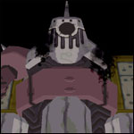
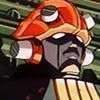
What a turnout! I'll try to comment on a few, though it might not be very useful since I'm too starry-eyed about the whole thing to be very critical. Inclover: Eyepatch~ But yeah. It looks almost like the image was burned into the page. It's a lovely effect. I was also a little curious about Bon, but there's really no pleasing people when it comes to him, so I can't blame you for omitting him. XD Also: eyepatch~ fab: <333 Big ups for combining Inclover's prompt and mine. You've succeeded in making birdbots tooth-rottingly adorable. And I am totally down with Loath-Claus, as much as he looks like he'd give little children nightmares. The coloring technique you tried works really well, I think, and makes the room look dim and restful. And the dodge gives the light from the fire a nice glow. In short: thank you. It's awesome. GSG: Gotta love the perspective, with that claw coming right at your face. The colors are dark without looking muddy, too, which is easier said than done.  Dragge: And here I was convinced that this prompt would end up being fetishy. Bravo to Dragge for taking the high road and keeping it clean. I only ask...where's the wimple?  ; Blues: I like the attention paid to giving the ground some texture, and shading the cannons to look metallic. Ness looks nice and small compared to the Bonnes' machine, too. I know it was a rush to get these done, so can I assume you planned on shading everything else, too? Dashe: Let me guess, Tron tortured her servbots one time too many? Love the servbots' expressions, as well as Tron's look of bewilderment. Emeltee: Way to get right to the heart of the prompt! This flows very well. I can't find a single panel that looks out of place or forced. A great action scene works without any additional explanation. Mr. Ninja: Good attention paid to background, detail in the armor, and portraying the relative sizes of Megs and the Bruno. My only nitpick is that the laser-thing looks a bit reminiscent of a zucchini. It's probable the lines running down the length of the beam, or the rounded-off end. I don't know. Jorsh: There's Maria, and there's the fox, but that snow-zakobon steals the show for me. So cute. It's a little hard to see, though. I'd say either put a little more muscle into your pencils, or crank up the contrast with your scanner software, since scanners can sometimes make pencil work look overexposed. And to reply to comments on mine: Yes, it's vectors. No, I had no clue what I was doing until I'd bludgeoned my way through about half of it. XD The shading is basic, just lasso selection followed by a gradient fill. I'm glad it came out decently. Hopefully I can try something more involved next time. Also, I hope Mirak likes it. Trigger/Roll isn't my forte, but I can see them doing something sweet like this...? |
|
|
|
Post by Dragge on Dec 27, 2008 14:04:45 GMT -5
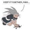
The wimple is there actually. Just not on Tron's head. If you look at the servebot jumping up and down on the bed you'll see him wearing it.
|
|
|
|
Post by TheJorsh on Dec 27, 2008 14:13:31 GMT -5
aww, that cute little servbot looks so happy chewing off Tron's leg! ^_^ The facial expression on the one sitting on top of her with a club was perfect, And is that a chainsaw in the back? Awsome. Simply awsome. ------------------------------------------------------------------------------- Maria's Daughter with the foxVery cute. Although I think you might have done better if you had added a bit more pressure in your pencil work. Still very sweet. ;D Jorsh: There's Maria, and there's the fox, but that snow-zakobon steals the show for me. So cute. It's a little hard to see, though. I'd say either put a little more muscle into your pencils, or crank up the contrast with your scanner software, since scanners can sometimes make pencil work look overexposed.The actual picture looks good in real life, but when I tried to scan it, it just kept making it brighter than it was supposed to be.  ANOTHER EDIT: Am I allowed to use part of the pic Dashe did for me as an avatar? |
|
Frankenpetey
Gorubeshu
Official MMLS Genre Sage
"It's for the family!"
Posts: 220
|
Post by Frankenpetey on Dec 27, 2008 16:02:34 GMT -5
TheJorsh: Scanners are a pain. Too big, too bright, too faint, it's always 'too' something. Most scanner software have options that let you play around with brightness and contrast, though. If there aren't any sliders or anything in the main window, you could go hunting around for a Preferences or Settings menu. I don't think Dashe would mind, but I'd send a PM her way to ask as a matter of etiquette.
|
|
|
|
Post by Dashe on Dec 28, 2008 0:37:53 GMT -5
Haha, I'm not sure if I can give critiques without sounding like an insensitive, talentless jerk, but I'll try! Though I can't really say it'd be much use. My piece? Petey's right. If I were being roped into unpaid servitude and tortured on top of that...let's say that coup d'etat would have occurred ages ago. In-Clover, you already know you're fabulous.  Texture art just plain looks awesome. fab, it's kind of funny, I could tell which one was yours straight away but I wasn't sure which prompt you'd been assigned...it actually could've been Petey's, In-Clover's, or Mr. Ninja's. Which is rather nice as IC and Ninja don't have art yet. The blue fireplace backing looks kind of odd but Santa-Loath's awkward grimacy grin makes up for it. It looks like he just swallowed a sweat sock. Dragge, you nailed the peaceful nun expression but you kind of lose a lot of the stuff in the background since most of it is sort of crammed up top there, probably why so many people missed the wimple. Composition is king, young padewan.  Petey Petey, your picture looks like an MP3 ad. In a good way. I like that you used vectors simply because Mirak uses them himself. The faces look a little squashy but again, there was that time restraint thing. GSG, the colors rock. I actually think that one claw that's coming straight at you looks kind of flat, simply because it is coming straight at you and the metal that's farther way didn't get darker or fade into the distance as it went back the way normal atmospheric perspective works. Come to think of it, the whole reaverbot was just one color with some shading. I could go on and pull an MLT with this sort of thing but I'll just stop here. Blues, I am totally digging those gun highlights. And Tron and Teisel. Especially Teisel. The ground, not so much, as it kind of looks like standard MS Paint fare compared with the precision of the straight line tool-esque robot. MLT--it's cool, but like everything else you do...it's very long. XD You need to work on summarizing. Mr. Ninja, the fact that you remembered that the letter in the Old City was a W even though it's east makes me smile. And the beam sort of does look like a zucchini. Or a pickle. A pickle-sword! But I like Mega Man's armor. Jorsh, pump up the contrast, for all our sakes. My myopic grandmother can't see the adorable fox. XD |
|
|
|
Post by Blues on Dec 29, 2008 17:34:04 GMT -5
Hey, I'll hand over my 2 cents for comments. [- = ’s picture to ] Dragge-Aimman (Tron as a Nun): Not bad, considering the circumstances. I like that it has a well-made background, too...shame that some of it gets cut out on the frontpage. Inclover-Dashe (The Bonnes, severn years older): I like the look and colors of this one. Looks like Teisel's starting to lose some hair, too. What did you use to make this? Petey-Mirak (Megaman and Roll lovey-dovey): This looks really smooth, and the shading is nice too. Though Mega Man's armor collar looks a bit too...pointy. Other than that, it's great, especially the hair. GSG-fab (Dark, atmospheric reaverbots): Really cool! It looks like it was made with a paintbrush (was it?). The reaverbots definitely look threatening and dangerous, like they're going to pop out of the screen and attack you. Blues-Musashi (Ness fighting the Bonnes): I was happy when I received this assignment; I'm a big fan of the Mother/Earthbound series. I have to say, despite the mistakes I made, I like how the picture turned out. One last thing; this wasn't the picture I had originally envisioned and set out to make. The picture I intended was supposed to be more epic and featured all the Bonnes and Servbots, a wide variety of Bonne machines, and Paula and Jeff with the Skyrunner. Unfortunately, my schedule, combined with the deadline, forced me to do a different, less time-consuming picture. I'm still willing to make that picture, if you'd like. fab-Petey (Cosy): This is a great interpretation! It looks very professional. Loath-Claus and Elf-glyde made me laugh when I saw them; it's certainly not what you'd expect form such a pair, after all. Great job! Dashe-Jorsh (Tron and Servbots): Quite the fun piece. More detailed than it looks at first, actually. For some reason I thought "Cannibal Servbots" when I saw it, even though that's not really what they are. *shrug* The Servbots do look happy to be destroying their mother, though... it would be somewhat disturbing if not for the Servbots. Might be a little creepy, honestly... Mr.Ninja-Emeltee (Point-Blank): Nice picture, especially Trigger's armor- very nice. I assume “W” stands for “West gate” and not ”Wily boats”, right? Emeltee-Heat (Action!): This is awesome. Dude, you should try going into comic-making or something- you’ve great at this. The action flows really well, as Petey said. Also, Trigger’s scarf is the best. If only they put it in MML2…Excellent work, excellent work! Jorsh-GSG (Maria’s daughter with the fox): Looks great. Maria’s daughter is well-drawn, and so is the fox. The colors fit the area, as well. The only bad part here is the relative size of the Reaverbot to Maria’s Daughter. Aimman-Blues* (Battle Royale: Diggers vs. Pirates): Heat Sonata-Mr. Ninja* (Mega Man Legends Christmas Card): Musashi-Dragge (Dragge Vs. Nemesis): Mir@k-Inclover (A Birdbot Christmas):Pretty cool. It feels cozy ( ) ; the Birdbots almost look...innocent... This should be good for now. I’ll update it when the last few submissions come in. Can’t wait to see the rest of ‘im... (hint) *=Logically deduced, but only from the fact that I didn't get a PM. If HS hasn't sent it yet, then I'm sorry for the presumptiousness. |
|
|
|
Post by Musashi on Dec 29, 2008 19:22:13 GMT -5
Just to let the person I'm doing know, I have Dragge's, and it's ALMOST done. If you'd like, I could post the WIP, or pm you it, alternatively.
|
|
|
|
Post by Dragge on Dec 29, 2008 21:16:24 GMT -5
I have been waiting for it but I can wait longer. I'll see it when it's done Musashi.
|
|
|
|
Post by Santa Melty on Dec 29, 2008 23:25:56 GMT -5
Okey dokey, here I am. So, regarding my submission: Trigger and Sera/Geetz, having a fight on Forbidden Island prior to the events of the games. I was originally contemplating a painting, but decided to take the prompt a little more literally after I found that I couldn’t think of anything to paint. I’d always done badly with sequential art, but it had been a couple of years since I tried it seriously. And I’d certainly never attempted an action scene before, so it seemed to fit the criteria of being something I wasn’t particularly familiar with, in any case. So, I searched up a bunch of manga and webcomics to use as examples, and went at it. My original plan was much more ambitious. It was essentially what I submitted, but much cleaner and fully toned. However, it soon became apparent that there was no way that was happening, so I just ended up submitting what I could do. What’s up now is kind of an extended layout sketch of what was originally to be. It worked, though. My main goal was really just to get the panels to flow nicely anyway. And by the looks of the feedback, well, it seems like I've done it.  As Dashe said, ‘tis long, but I don’t think it could be helped. Action sequences are not very space-efficient. And anyway, if I wanted to practice panel layout, the more panels the better. And to everyone who commented on mine, thank you. Now, as for everyone else’s: From Dragge: Agreed with Fab; practice with anatomy and perspective will be of help. Shading as well. That all comes with time, though. Otherwise, as has been said, good work at filling up the space in the background. There's quite a bit to look at there. From Inclover: I said this already, but awesome work. I actually thought it was traditional the first time I looked at it. I’ve nothing to criticize. Tron does stand out much more than the rest due to the sharper line of the hair and the green eye, though. Not sure whether or not that was intentional. From Petey: I like the composition and style. Nicely done. If you’re going for a vector look in Photoshop or some similar program, I’d recommend the pen tool over the lasso, though. A little more time consuming to use, but you can be much more exact. From GSG: Good perspective and accuracy (with the reaverbot’s anatomy, I mean).Shading is subtle, but it works. I like how unified the color scheme is, though the tones seem a little... subdued? I don’t know. All the blue is rather relaxing, as opposed to fear-inducing. Also, the background could use work, but I believe you explained that. From Blues: Pixel art really isn’t my thing, so I can’t get too specific. But for me, it’s hard to tell whether the front of the machine is flat or curved. If it’s curved, the lines along the surface should be bent around it instead of straight; if it’s flat, the guns probably should be at less of an angle. I think the robot would have looked quite nice in 3-point perspective, with the viewer looking up at it. Would have emphasized the size difference, I think. There’s also hardly any shading at all, but that may have been the style you were going for? Anyway, I’ll be sure to look at the second version of the image if you end up making it. From Fab: Interesting interpretation of the characters. For this one, I’d say... Try using cooler colors for shadows, and warmer colors for lighted areas, especially if the light source if a fire (rather than just coloring darker shades to more saturated shades). Overall, try using less dodge for highlights, as it looks rather unnatural, especially in the fireplace. The texture on the fabrics and fireplace is pretty nice, though the lack of texture on everything else makes it looks somewhat out of place. Also, I’d suggest playing around with line thickness. From Dashe: Interesting style, interesting idea. Could be a little cleaner, especially with the faces. It was hard for me to discern a couple of the expressions. The blue of the servbots also clashes with the red of the background, but maybe that was the effect you wanted. From Mr. Ninja: It’s a cool idea, Trigger landing a midair headshot on Bruno like that. Like Dragge, I suggest practicing anatomy and perspective (though perspective is more important in this case). Compositionally, I don’t know if the sun up there is really conducive to the inherent epicness of the scene; emphasizing the hazy, gloomy atmosphere of the old city may have suited the picture better. That also could have allowed the brightness of the laser to stand out more prominently. In any case, thank you for the gift.  From Emeltee: Oh, don’t even get me started on you, punk. From Jorsh: Alas, it seems that the link no longer works, but just going from memory... Well, it’s hard to say anything about it because of the scanning. It was simple, but cute, I remember thinking that when I first saw it. But... That’s all. o.o Anyway, there you have it. Thanks to everyone who commented. ;D I'll say a few words on new ones as they are submitted. |
|
|
|
Post by TheJorsh on Dec 30, 2008 11:16:17 GMT -5
oops.
I guess I deleted it last night when I was deleting some other stuff.
I'll put it back up as soon as I can.
|
|
|
|
Post by Mr. Ninja on Dec 31, 2008 17:19:35 GMT -5
You're right Emeltee, the sun doesn't go with the old city very well. I definately should have left it out.
|
|
Heat Sonata
Gorubeshu
*takes the art escalator*
Posts: 269
|
Post by Heat Sonata on Jan 10, 2009 20:38:16 GMT -5
Urgh, I'm way late. I overestimated my drive to work on a deadline during the holidays a lot. >.<;
I know it doesn't make up for it, but I am still planning to do mine although I left the original draft at home. I'll make sure the one to receive it is notified via PM.
Again, major apologies. I feel especially bad because MLT's for mine was so nice.
|
|
|
|
Post by mirak on Jan 16, 2009 6:11:14 GMT -5
I didn't make it in time, no excuses for me. Better late than never i think... Sorry for being so incredibly stupid. Here is mine.  Oh, someone over deviantart wondered what was the birdbot at the top doing:  Let's say he's setting up Glyde's chair, maybe? |
|