|
|
Post by Aim on Dec 31, 2005 16:48:22 GMT -5
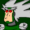
I figured just recently; what's better to encourage community togetherness and more frequent RP posting on a message board than a delightful, 200 KB animation of an RP character pulled out of the Shengosu entirely at random? So, in honor of both the new year and the RP, as well as the fine Legends community, I give you an Osiris animation I made entirely on whimsy and with little or no foreplanning... I hope that doesn't show.   Hopefully, I'll get around to making a few more of these... What? My own characters? What do you mean I haven't drawn my own characters yet? Heresy! Necromancy! Oh, and by the way, I used one of your pictures as a concept mltmlt. I hope you don't mind, it's just that I had a tough time visualizing Osiris beyond the bandages... That's very Roll like hair, looking back on it. And to you, Final Hazard, I was wondering if I could post this on my DA account. I thought you should get a choice in the matter. *Two problems I just realized: a) Might have overdone the torso armor  and b) That other bandage is just kinda floating, which doesn't work well in an animation. Oh yeah, and c) The armor's kinda crooked. |
|
|
|
Post by Edwardo Rocket on Jan 1, 2006 11:46:37 GMT -5
YOSH You may, Aimman, you may. This is awe-inspiring.  NOTE: Start of the new year will mean I'll start posting in the RP more often, by the way. |
|
|
|
Post by Santa Melty on Jan 1, 2006 23:12:35 GMT -5
Nicely done. A simple animation, yes, but very smooth, and I’m honored that you used my design.
I’m just not honored that you didn’t use my character. Shame on you. Mine has a hat.
As far as how it looks, yes, the armor is very, very crooked. But it is proportioned just fine. The lines on the armor lack proper depth though. The armor extends outwards to the midpoint and then comes back in to meet the body. The way you draw the markings makes it look flat, almost contradicting the armor itself. Needs a little more curve to it. o.o
The floating bandage can be fixed easily, nothing to worry about. I love the face though. Your style of head fits very well on that body, and the expression is eased, but sits well on her.
I hope you get around to making more of these with different animations. They look good, especially for an impromptu job, and they’re great propaganda for the RP.
|
|
|
|
Post by Aim on Jan 15, 2006 19:44:08 GMT -5
I'm a top-hat fan meself, mltmlt. I was hoping to get around to that one soon.  Whew. Yup. It's crooked all right. But still, thanks for commenting to you all. And I'm glad you like it FH. After I'm done with as many animations as I can/care to do, I might go back and color the master picture of each of them. But for now, I'm thinking they'll all be black and white. At least I remembered layers this time so I can go back and color.  Fortuna this time. The pose is pretty contrived for a talking animation, but this one does seem to animate more smoothly than the other. The only actual mistake I made in animating seems to be that a small triangular mark appears at the side of her hair for a second. But, other than that, any other flaws are purely attributable to my flaws as an artist. ;D ...wait, that's not right.... Anyways, you guys can tell me what you think right after you all go and make 15 more RP posts. |
|
|
|
Post by Santa Melty on Jan 15, 2006 20:52:05 GMT -5
Ha ho! More Fortuna. In the words of Finalhazard, YOSH! And since it’s my character, I won’t complain about anything. Not that there is anything to complain about. Don’t worry about your flaws as an artist. Some might call them flaws, but most will just attribute it to individual styling, so you have nothing to worry about. ... That was a compliment, by the way.  Do you plan on making any more RP character animations? I’m thinking that those two kids of Dashe’s would be given great justice by your knack for expressions. Anyway, if you do make any more, try changing the pattern of blink, blink, talk. The animation itself is nicely done, but all the blinking makes it look a little awkward. |
|
|
|
Post by Aim on Jan 15, 2006 20:58:28 GMT -5
 ... Mehe. I made that on the off chance that you'd decided to check Gesselshaftgal's topic and skip mine completely. :-*You're just a long poster, no worries, it's a good thing... What?... Minute to minute board stalking? Whuzzat you say? I'll try a different formula for the next then.  ...Would it be an awful, sinful crime to say I don't know Dashe's characters? She, er, she hasn't posted in a while... If you give me descriptions I'll do them. |
|
|
|
Post by Edwardo Rocket on Jan 15, 2006 21:31:49 GMT -5
Eh, you guys can say Yosh. I just say it because Robotnik says it. XD
Great artwork, AimMan.
|
|
|
|
Post by Dashe on Jan 15, 2006 23:13:40 GMT -5
I'll do better than descriptions.  Really all you need to know is that Lin's tall and skinny and Den's short and fat (the cute kind of fat, not the gross kind), since your animations are in black and white anyway. That, and Lin's supposed to look like a digger, and Den just looks like some kid off the street, his outfit doesn't matter too much, except for the hat. Personality wise, Lin can usually be seen screaming at or abusing Den, and Den is often found cowering in fear or taking some kind of punishment from Lin. Den = wimp, Lin = tough. It's not very complicated. Even if it was complicated you'd still find a way to do them justice. Oh, and one more thing. Den and Lin aren't ones to blink and talk, if you get my drift. Maybe have Lin repeatedly punching Den in the face or something? It doesn't have to be complicated if you don't want it to be. ^_^ |
|
|
|
Post by Aim on Apr 8, 2006 0:57:04 GMT -5
Oh. I'd forgotten about that request from Dashe. I'll have to get to that some time. In the mean while, I finally decided to draw one of my RP characters. It's the extrovert, zenny-pilfering ex-sky-pirate, Ruth Hammer:  Hopefully I can get one of Apollo done too. I was even thinking that once the RP is over, I might make a large, more stylized pic with many characters. Huh? Doesn't that make you want to go post more on the RP? |
|
|
|
Post by Santa Melty on Apr 8, 2006 4:41:21 GMT -5
Ah, nicely done. You beat me to drawing her, though I suppose I can forgive you, seeing as how it’s your character. *strokes chin* The reflections on the chest plate seem to make it look somewhat flat. Or is it supposed to look like that? It’s hard to tell. Other than that, I like the design, and the style is very you. This one isn’t animated, but it’s colored. Which is better for me, since my dang blasted corn-picking sonofa four-eyed firewall blocks all animated images. Saves a couple of clicks on my part. And didn’t I say something on behalf of that other Fortuna picture? No? It has very nice eyebrows. I give it my crest of approval. *stamps image with large picture of me giving thumbs-up* And to Dashe: I was going to try to draw your characters. But for some reason, I can’t see the bottom half of your image. I told myself I’d ask you about that in the morning, but I forgot about it for four months. I don’t suppose it’s your fault that I can’t see the images? Or am I ignorant and need to adjust my internet settings? o.o Finally, that idea for a group shot is a marvelous idea. The game has certainly been memorable. And long. Yes, very long. I’ve been wondering how one would go about commemorating something of such fantastic brilliance and length for some time, and a group picture would be perfect for when we finally get this done with. It’s also pretty obvious. I should have thought of it, given how much time I’ve invested in its pondering. But it is a good idea nonetheless. However, it shouldn’t merely be a group shot. No, not at all. It should be a mosaic of the collective ideas within story we’ve created. It should have backgrounds, and gradients, and really fancy eye reflections, and all sorts of complex things in the sky. And there should definitely be a depiction of the reaverbots. Why not make it a collaboration piece between anyone who wants to help? We could really go all-out with this. Make some huge site event out of its release, even. It won’t be as stylized if multiple people help with it, true, but with any luck we could improve the overall quality. We could even make a competition out of it, like what was done with the MMLS Christmas/winter images that were used on the front page of the main site. Then we’d get stylized pictures in large numbers instead of a single, more... unstylized picture. This could be BIG! *pounds fist on desk* EDIT: All right, I take it back. The chest plate doesn't look flat. The reflections just don't seem to be in a natural position. But that is just a gut feeling. I have no idea how light proceeds with its reflecting. I’m going on 3 hours of sleep here. Cut me a break. |
|
|
|
Post by Aim on Apr 8, 2006 11:24:25 GMT -5
Ah, thank you mlt! 5:41 AM?! I guess it's true what they say/sing about mltmlt... He works hard for his-Oh wait, I've already sung that at this board before. Nevermind. I'd love to do a collaboration picture myself. I could definitely do my own characters and the Alter Greul (I like to keep from mentioning ever having to draw Team Decker's Robots, for some reason. 0_o I might be able to the Schnelles Feuer). I could probably draw other people's in too. And on another note; you are most definitely correct about the chestplate's shining being off. I really couldn't make myself pay attention to a light source, for some reason. |
|
Teisel Bonne
Cannam
 Though i may not post much, rest assured im usually lurking around
Posts: 390
|
Post by Teisel Bonne on Apr 8, 2006 15:45:46 GMT -5
ive not got a custom character to draw  but i have got a custom robot to draw, the Zerstorer it means destroyer in german or something, i cant quite remember  ill have a go at drawing it this week |
|
|
|
Post by Pitch on Apr 8, 2006 23:13:40 GMT -5
Oooh, my. Green and Silver. What an excellent color scheme! The two colors compliment each other very nicely. I'd be a bit uneasy about wearing such armor though, considering there're a good few areas left uncovered. but the coloring is beautifully done, with a lot of attention to subtle little details. Very nice |
|
Teisel Bonne
Cannam
Though i may not post much, rest assured im usually lurking around
Posts: 390
|
Post by Teisel Bonne on Apr 9, 2006 16:16:05 GMT -5
i just realised AIM YOU TRAITOR, BLINKING PICTURES IS MY THING
that whole cast picture would look really great, especially with all these interesting characters, as to what you said mlt, i would love to chip in to make a peice of cooperative artwork, i might even be able to get my dad interested if one of you emails him or something ?
and i also noticed that i can only see the top half of the picture of lin and den, all below dens eyeline is grey. is it meant to be like that?
|
|
|
|
Post by Aim on Apr 10, 2006 17:21:38 GMT -5
Oooh, my. Green and Silver. What an excellent color scheme! The two colors compliment each other very nicely. I'd be a bit uneasy about wearing such armor though, considering there're a good few areas left uncovered. but the coloring is beautifully done, with a lot of attention to subtle little details. Very nice Ha ha. You have a point about the armor. I guess Ruth isn't exactly what you call a "practical digger." I love green and grey color schemes. I'll miss her whenever we start the new RP. Yes, TIESEL, it would seem that for whatever reason, Dashe's full pic isn't loading. It comes up halved here too. On another note, I actually thought of making a Loathe animation like yours for April Fools Day. I thought of it too late though. It would be great if you helped collaborate, but I'm sure your father's busy now, right? He probably doesn't want to be pulled out for a project he knows little about.
 Here's one of Apollo. Man, I can't seem to make him seem young in a full black suit and tie with white hair. It's, er, decent, but once again, I wish I could have made him seem a little younger. EDIT: Ah, that's better. The coloring didn't like .gif formatting. |
|