|
|
Post by mirak on Aug 19, 2008 15:22:41 GMT -5
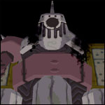
This is pillowshading: 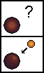 ...? Sorry musashi but i see no pillowshading.  Claymore and Loathe has a top-frontal light source, the rest of the sprites have minor shades and most only have highlights, what you see as pillow shading are the obligated outlines given to the already lacking shadows included in the RPG XP RTP, look at them and you'll see they used them too, if a little. Volnuttcase, try using pastel colors, you're using agressive colors and those are a no plz on pixel art, since they become a bother in the viewers eyes.  The flashing white rectangle covers the primordial "AUGH" colors, wich must not be used in pixel art. Ever. I can go in a deep explanation of how to select a good pallete if you wish. |
|
|
|
Post by Musashi on Aug 19, 2008 20:53:01 GMT -5
Ack, sorry, I thought that Loath's outline was actually shading(thought it was two colors; the outline looks thicker than just 1 pixel.) That's what I was mainly referring to. I should've been clearer.
The shading could still be improved a lot, especially since there is a distinct lack of shading on some sprites (like Data).
Also ditto what Mir@k said, but you're not limited to pastel colors. Just try not to use very, very saturated colors.
|
|
|
|
Post by mirak on Aug 19, 2008 21:10:59 GMT -5
Roll's hair is so difficult to make in pixel art. :C
|
|
|
|
Post by volnuttcase on Aug 19, 2008 21:46:12 GMT -5
Yes if you could go further into AUGH and what palette I should choose, it would help out a lot
and what program is that with the light source (or is that just an example drawing you did)? Did you say you use fireworks??
|
|
|
|
Post by Musashi on Aug 20, 2008 0:26:33 GMT -5
Roll's hair is so difficult to make in pixel art. :C I know what you mean. My last attempt at Roll's hair literally caused me to stab my eyes out. I had to get transplants.  |
|
|
|
Post by mirak on Aug 20, 2008 0:37:02 GMT -5
It's just a quick example, not a program. Pixel art has to be made pixel by pixel anyway, so even if it was a program it wouldn't give you any shortcuts. =P Here is how fireworks looks like, with the grid activated and zoomed at 800%.So, here's what i got to say about hard colors and correct palletes. As i said before the white rectangle that flashes is covering the colors that must not be used. In order to convert and mix those colors to achieve a better color suited to the eye i made this quick little example. So, for the sake of learning i drew a sprite:   In the first one i used the AUGH colors (by the way, 'augh' doesn't stand for anything, it's what i yell each time i see those colors in sprites), in the second one i modified the colors a little and in the third one i lightened the alternate colors from the second sprite. A color pallete from a spritesheet is a recopilation of the colors used and their scales, here are the palletes from the sprites above:  First pallette, with the horrible horrible base colors.  Second one, with the corrected colors, but they're a bit dark...  Third pallete, there! The colors are just fine now. But what exactly did i do to select the best colors? Here's how. This is my method, so there may be better ones, anyway... The base colors hurt the eyes too much, our best bet is to mix them with some grey:  (sorry for the bad quality, but you should get the main idea) Then, to achieve the last, bright but not harsh colors we add a little luminosity:  And that is how we finished our little sprite, see it again, notice the great difference from when we began? I'll explain shading if you wish. |
|
|
|
Post by Pitch on Aug 20, 2008 1:02:57 GMT -5
That's actually 800 %, which is only 8x. 800x would be freaking insane...  ; I did a double-take when I read that. the rest of that was interesting.. Oooh, and volnuttcase, the better quality file looks loads better than the other one. Very nice. Do Yuna.  (just kidding) |
|
|
|
Post by mirak on Aug 20, 2008 1:10:25 GMT -5
Ok then, i'll fix it. |
|
|
|
Post by volnuttcase on Aug 20, 2008 14:44:43 GMT -5
Wowww thanks Mir@k So pretty much I just darken the colors a bit, the way you showed me (I'll do that right now, like darken Roll's clothing and hair, then I'll show you) And yeah I would like to learn more about shading I just dont want you to feel that I'm wasting your time  you're very good at teaching this sort of stuff Oooh, and volnuttcase, the better quality file looks loads better than the other one. Very nice. Do Yuna. (just kidding) haha, thanks Green. Like I said, I'm going to be doing all the characters and reaverbots and when I'm done, I'm going to consider a fangame, but no promises on a fangame, I wouldnt be that dedicated since college is about to start blahhh.. ---------- So my schedule is, I will work on 3 new charsets every sunday at my part-time (where I dont do much work lol) And I will post previews of them up here.  |
|
|
|
Post by mirak on Aug 20, 2008 19:31:34 GMT -5
I feel good teaching people because i always try to be as expressive as i can so no one has doubts and so far it has been pretty efective, whatever you want me to teach you that is inside my range of knowledge on pixel art, feel free to ask, the time spent explaining is well worth it when you see the results. So, shading huh? I'll take the sprite i created before, lets look at it:   Looks fine, but now we have to shade it, in order to do this we'll first decide a light source, light sources are vital to know how we'll shade the sprite so you have to think first: 1) Where will you place that sprite? 2) Where is the sun or light source? In this case, i decided is late afternoon when our sprite takes a tour to the city, so the light source comes from over here:  Deciding where the light is coming from will affect the place you put your sprite into, as i said above. For example, let's say you put your sprite in a bridge that has flashing lights below it, obviously the light source would come from below and therefore it needs a shading that fits that situation. Now, let's begin shading, first, let's take the pallete we made before and add the shades, this is the final pallette:  The last line of colors, the brighter ones, are the ones the sprite already has. What i did was add two darker colors for each of the pallette colors, the darkest one being the darkest shade and so on. To do this, i just selected the base color (the brighter one) and then darkened it just a little two times:  After i did that, i did the same with the rest of the colors, now the shading can begin. First we have to start with the darkest shade, wich must be included in small, but noticeable quantities, adding too much will make our sprite look bad:   There's really nothing i can say about where to shade, it's all a matter of logic, trial and error, you just have to focus on where you want the light source to be, shades are always on the opposite direction. Also, you have to take into account that caps and most hats makes a shadow in the forehead of the character. and if the arms of the character are on top of the body, then the arms project a shadow to the body. In any case, zoom in, paint the shades, zoom out. If they don't look good, zoom in, delete them, paint them again, zoom out, repeat. After we used the first shadow, we proceed to use the next one on our pallette, you can use as many tones of shades you want, but too many shades will give it a rubber look to the sprite. Here is the second shading applied:   And that's how we finish this little tut on shading, here is a little gif showing our process.  I can teach you highlighting and antialiasing if you wish. |
|
|
|
Post by volnuttcase on Aug 22, 2008 21:37:55 GMT -5
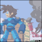
suree I'll use this thread for future reference in case I forget something please continue, if you wish ---------------------------------------------------------------------------------- Thanks to Mir@k's tutorials, here are some of the edits I did.. I didnt do the whole charsets, I just did the front standing views of these characters. Tell me what you think  Roll: I darkened her clothing and fixed up her hair. I added some shading using Mir@k's tut. I also fixed up her eyes a bit Teasel: Once again, I fixed up his hair. I also realized something wasn't right about his face, and it just so happened to be that he was originally missing his bushy eyebrows, so I put that in. I added some shading, once again, using Mir@k's tutorial, and I recolored the outline to a dark green. Mega Man: I recolored the light blue plating because apparently it corresponded to the "AUGH" colors that Mir@k showed me. So using his tutorial on using correct palletes i was able to make the color more appealing to the eye. Also I fixed up his hair (The reason his hair is different from the game is because I was trying to get that look from the Rockman Dash demo where his hair looks different and lighter.) Tron: Unlike the other 3 characters, I kept Tron's hair the same. What I changed was the pink, because it also was very close to the "AUGH" colors that Mir@k showed. I also darkened the outline and added some shading. Also, I fixed the shape of her face, because the original seemed a little awkward, making Tron look like a chipmunk XD |
|
|
|
Post by mirak on Sept 7, 2008 23:38:29 GMT -5
Woooooow, what a difference in comparison of the first ones you made!
They all look AWESOME man, AWESOME!
And sorry i wasn't able of continuing, i'll do it when i have time, right now i'm in my own pixel art projects and haven't had the chance to take screencaps and stuffs.
|
|
|
|
Post by volnuttcase on Sept 8, 2008 19:24:44 GMT -5
haha its ok  Well I'm glad you like them! Thanks to you, I wouldnt have known how to improve them I'll put up more on sunday, since I have a lot of college work to do thanks again! |
|