|
|
Post by Pitch on Jun 25, 2006 1:59:38 GMT -5
(I made a new topic because the old one was getting cluttered, and I think people were turned off by it from all the massive blocks of text)No sketchy lines, this time, I still don't think it came out just right, though. Since I set myself up with Fedora, I've had to get used to the GIMP program. It's really not that different from Paint Shop Pro - perhaps not Photoshop either, though I never really got much into that. I figured, though, just to get used to it, I'd make an attempt at a picture, something I've wanted to do for a few months now. The end result was this: w/Background(PNG 202K) w/o Background (GIF 28K) ... Yes, it is, Jedi Roll.  Not the Roll from Legends, of course, for obvious reasons. I got the concept from MegaMan: Powered Up. Rather than limiting Roll to a Broom, Capcom provided her with twelve alternate outfits(one for each month, iirc), all but one with an alternate object to swing away with(not actually altering the weapon usage in any way, unfortunately). And I thought, why not give her a light saber? "Because then she'd be Zero!" ... okay, yeah, I guess that wasn't as funny as I thought it would be. Geez, rough crowd. Ah, if Roll had a lightsaber, she could pwn Zero anyway. Oh well, back to the picture. I drew the outline here with a tool called the Caligraphic Brush, basically painted on a slant - almost like the diagonal line brush in MS Paint, but anti-aliased. It didn't give the best results, really, but I thought it might be better than something drawn with, say a square brush, or the eraser. Perhaps not better, but a bit more int'resting. Coloring and shading are all about the same as any other picture I've done; all hard-shaded again, though I'd like to think a bit less obnoxiously. I still haven't quite figured out a good way to go about doing lightsabers; gotta work on that. And I really just decided to be lazy with the hands, because honestly, they look better that way than they would've had I done them in more detail. Harder to do ladies' hands, I can do guys' hands - typcially pretty blocky, but yeah.. And yeah, the background for those who can see that one is three or four layers of white "star shaped" dots, with varying opacities, and a layer or three of different planets, so as to give that "some are closer than others" idea. The planets there were all created with various effects and filters the GIMP had to offer, appiled on some colors lazily slapped down in an eliptical selection. Also slapped a Sunburst like light behind Roll, just barely noticeable, slapped a dark purple down under it, did that cool line-y effect, and slapped black down under that. Well, the sunburst thing is in a layer directly below Roll, the planets, stars, and all that are below that, and then the black and purple mess below that. Other than that nothing but a simple "Pitch '06" in a faint, but noticeable gray in the lower left hand corner. And, yeah.. that's all she wrote.
|
|
GSG
Cannam
 o_e
o_e
Posts: 331
|
Post by GSG on Jun 25, 2006 6:26:21 GMT -5
Heh, wise move.  That's excellent. The single thick outline compliments your hard shading style very well. The background is cool too, even as a stand-alone piece, but I'd be careful in future not to choose a background that detracts from the actual subject of the picture. The style the planets are coloured in is very different to your own style, so in my opinion it's not too flattering, although you did seem to go through a lot of trouble to draw attention to Roll. On the anatomy side of things, I've done a fab and made a coupla' changes: 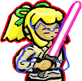 - The fringe I would move down because the position of her face would suggest that it's tilted downwards, which means the focus should be drawn to crown of her head.
- The arms I've jiggled about a bit too, as the right arm in particular looked a bit odd. Looking back, I think I can see what you were trying to do - slightly leaning Roll and moving her arms back into a half fighting stance. I've drawn them in a more neutral position which fits with the hands better.
That's all. The Trigger picture is fantastic. I can't find any faults with that.  |
|
|
|
Post by Pitch on Jun 25, 2006 12:51:00 GMT -5
Thanks ;D I still don't think the outline looks quite right - and it's definitely much too thick, imo, but I suppose it's better than the sketchy look.. The background was a last minute(well actually, it took about an hour, but that's because it was a) "push as many buttons as you can!" type deal, because in drawing and coloring the picture, I only used a few of the tools GIMP had to offer, and I wanted to explore further. A sort of "What does this button do?" mentality, there. Just kept expanding on it. First it was just a purple gradient for a background, with an almost eerie blu-ish light behind Roll, then I threw the stars in. The stars didn't seem like enough so I started throwing planets in, and somewhere in the middle of it, I found that cool liney effect and thought "Hey, why not work that in?" My original idea for a background was just to do a MegaMan-type area, probably with the classic Robot Master door off toward the back, seeming to suggest Roll was about to kick some Robot @ss, but I couldn't seem to get that to work. I think it might look better if I drew the hair like that, as though her head were tipped down, but the angle it's at now was pretty much intentional, because the angle the light saber's at, it almost seems to me that if she inclined her head any lower, the saber might go through it. One thing you learn when you're fighting with lightsabers is that you tend to want to keep your own body parts away from them. I wasn't really sure what to do about the arms. I'd demonstrate the pose I was going for, but I can't seem to find my digital camera. The arms were kind of meant to be pulled to the right, which , looking back at it, I didn't really do very well. I don't know if I wanna go back and fix this one that much, or just leave it be. The Trigger picture literally was a 15-minute (not really MS)Paint doodle. It would've been somewhere between five and ten minutes, but without the usage of layers I went over my lines a lot, and had to keep going back and fixing them. It was, for the most part, all done with the eraser. I alternated between that and the paintbrush, just in the less squarish areas, and I may've used the Paint Bucket a few times just to save time. |
|
|
|
Post by Musashi on Jun 25, 2006 14:09:44 GMT -5
The only thing I see wrong besides the things G corrected is how many random creases you have. I suggest looking at this tutorial if you wanna learn about them. |
|
|
|
Post by Pitch on Jun 25, 2006 14:17:28 GMT -5
I suppose they're far from perfect, but it's not really as detail heavy as that picture there seems to be, and she just looked wrong without 'em. =/
|
|
|
|
Post by Musashi on Jun 25, 2006 14:40:54 GMT -5
Well she kinda looks weird with 'em. Maybe next time use alittle less creases then..?
|
|
|
|
Post by Aim on Jun 25, 2006 15:07:04 GMT -5
Well, I think Musashi may have a point about the creases. I don't think there need to be less creases, but it might help a bit to keep them flowing correctly. For instance, try to think about where creases could be realisticly. I know it's difficult to do; I still have a very hard time avoiding making the creases look like last minute add-ons. All the same, it really can probably help. For example, a crease such as the one Roll has on her shoulder in this pic is improper, because being positioned as the crease is, it would imply that the shirt bent inward. You must think of where creases actually appear on clothing; one around the shoulder is better placed coming up from the pit, perhaps, but not actually following the curve of the shoulder. I'm not sure the hair has to be moved up; it mostly depends on the size of the eyes. If you want to keep her with her current size, then you might want to go for GSG's idea. I myself might have raised the eyes up a bit, and if you did that, I think you might end up with it about where it needs to be anyways. But it's always a little harder to estimate when they're closed. Another thing that might be nice to remember for realism's sake is that, considering she has a sash on, it should get tighter around that area. Something about the sash expanding outward as we go down, as well as the tunic, imply's that the widening area is the belly rather than the hips, which probably isn't the look you were going for. The little stars and things are fun. But that one middle-right planet kinda erks me. It doesn't seem much like planet texture. Now I'm just being picky though. Your l33ts4b3r sure is l33t looking. Anyways, good job hopping back to it. I really have to draw something myself now, lest I be hypocritical in my promotion of the Fan Work section. |
|
|
|
Post by Pitch on Jun 25, 2006 16:31:43 GMT -5
Well, I think Musashi may have a point about the creases. I don't think there need to be less creases, but it might help a bit to keep them flowing correctly. For instance, try to think about where creases could be realisticly. I know it's difficult to do; I still have a very hard time avoiding making the creases look like last minute add-ons. Yeah, they pretty much were last minute add-ons... I suppose I could've done 'em a bit better. I'm not gonna go back and fix this one, though. I guess that would make more sense. I wasn't really sure how to get that sideways look with the shoulder. Ah well. Moving the eyes up might help, I guess, but again, I'm not really adjusting anything. It's done, as is. I'll try to keep that in mind next time, perhaps. The sash never appeared to be all that tight to me, just ask Obi Wan. I guess I should've narrowed that a bit. It was a bit confusing with the arms already in place, but I thought it ought to appear to be on top of the clothing. Could've been a little tighter, yes. Really? It was one of my favorites... n00b looking, maybe. you know my suggestion. |
|
|
|
Post by Santa Melty on Jun 26, 2006 0:58:51 GMT -5
You don’t mind if I still go and post on the old art thread, do you? I’d like to know that I finished responding to everything. o.o
I can’t add much to this one, as most of it has been said. The arms need work, as do the creases in the clothes, which appear to be positioned randomly. You seem to have put a bit more effort into this one, though the background does distract slightly. The stars and spiky background effect is fine, but the planets look out of place, even if they do add some color to it. I don’t know much about Jedi, so I’ll skip on the bit about the sash. The hair that comes down on the side of her face has that square look I mentioned back when I was commenting on the Yuna picture. I’d say thin out the shine there a little, like how you made the shine on the armor on your previous Trigger picture.
The eyes also look odd. The first time I looked at it, it seemed that the eyes were open, but had no pupils. Like the eyebrows were the top of the eyes. It took some staring before I realized they were closed. I’d suggest making some small modification to the eyes in the future, perhaps so that the eyebrows are the color of the hair or so that the top of the eyelid has a few small eyelashes or something, simply so that the two can be distinguished from each other. It is a small detail, but I think it will help.
As for things I like, the lightsaber is nicely done. I can’t really think of any decent way to go about with it myself, unless you go for all-out realism, but that would be a bit difficult, and wouldn’t match the style of everything else. The lineart I especially like. Double G is quite correct in her statement; it compliments the coloring magnificently.
As for the Trigger headshot, the shading is a bit too hard, but you used an eraser, so it can’t really be helped. The shading on the head and neck has the same square-looking shading thing going. I’d recommend against that. Also, on the face, there should be shading just below the hairline. As for the top of the hair, the lighter shade there works pretty well for one with his... shape of hair, though I think it might look better if you thinned that down as well, so it is just on the edge of the top of the hair. But then, maybe you like the thicker coloring. It’s preference, really.
|
|
|
|
Post by Pitch on Jun 26, 2006 2:25:24 GMT -5
You don’t mind if I still go and post on the old art thread, do you? I’d like to know that I finished responding to everything. o.o Please, go ahead, so long as comments for the pictures in this thread stay in this thread. If you've more to say about the Trigger and/or Yuna picture, it can go in the other one, I guess. Unless there's some rule against having two running art threads, but hey, you're the mod, not me. Strange as it may sound, I probably spent less time on this than, say, the Trigger picture. The planets probably look out of place, because I did them in a manner entirely different from Roll herself. I could try it without them, but iirc, that looked awkward... then again, I hadn't finished the actual background behind her before that. I'll try that maybe and get back to ya... that's just a quick delete of a few layers.. can't do it now, though, my computer's not online-capable at the moment. The bit about the sash is probably true, it should come in a little, and the bit below it come out, not too much, but at least notice-ably. You know, it was kinda hard to put the "halo" thing on that, but it is there. You kinda can't tell, because it curves right before the ribbon(perhaps I should've used a bit more contrast?), but the little loop-y thing is actually there. I'm not really sure what you mean by thinning it out, but I suppose, yes.. o.o Eyelashes!! AAAAAAaaaaaaaaaaaaaAAAAhh!!! I can't believe I forgot those! I don't believe I've ever done them before actually, but that's it, that's absolutely right. They'd definitely be needed in a closed-eye picture like this one. Shewt. I can see how it matches the style, but I still don't think I got it quite right. It looks too sloppy, not very light-like, but I suppose if it works, it works.. for now anyway. I had another idea but it involved a lot of layers and a lot of pain. I was actually surprised at how easy it was to do the lineart... I literally just drew it with the mouse, no line tools - be they point-to-point, bezier curves, or otherwise - just the paintbrush an empty screen and a lot of swiping. The Trigger headshot was - as I mentioned - a literally 15 minute piece of work, that would've been quicker if I wasn't so clumsy going over my lines in Paint. It wasn't meant as any sort of actual attempt on my part, and it really only served to sit at the head of my second most recent 1up Blog. I'm aware that the shading was a bit much, and in some places, not enough. I wasn't really sure what to do about the neck, but I'm really not sure what I was thinking with the head... I dunno, it was a rushed job, not a serious picture, and the only reason I posted it was to show how the line-art in the Roll picture differed from an actual squarish brush. |
|
|
|
Post by Santa Melty on Jul 3, 2006 23:17:03 GMT -5
Oy, late late late. Ah, I am, aren't I? o.o There's no rule to my knowledge. Not one directly applicable anyway. It's just a matter of judgment. Running two art threads about the same art would be breaking something or other, but you seem to have a legitimate enough reason for starting a new thread up. Ah, well, first, the contrast is another thing that is based on personal preference. Too much contrast can make something look like rubber while too little can make it look dull. But it depends on the look/impression you're going for in the individual picture. I notice what you did with the halo here, and I personally don't think too little or too much contrast was used. But that's just me, and I am quite unreliable. Second, I think we're on the wrong page again. I was talking about the long sideburns coming down right in front of the ear to about the chin, not the ponytail. Unless you were talking about the sideburns as well, in which case, yes, whatever halo is there is a bit too light to see. But I do see that one edge is dark and one is light, which gives it the look of a box that I‘ve described before. Looking at it again, it doesn’t seem as bad as I first thought, but all the same, I’d propose doing shading on areas like that differently. Maybe move the lighter shade a bit inwards into the hair so that it does not look like it is on the very edge, touching the actual lines. Also, looking at the lighting... is it coming from any direction in particular? It’s hard to tell. o.o Well, in any case, I say this way is much better than that sketchy thing you were doing before. Much more defined form. And if it's easy to pull off, well... even better.  Ah, I see. Sorry, I must have forgotten the bit about it being just a trivial work rather than an actual attempt when I got around to writing that response. |
|