|
|
Post by infinity on Oct 1, 2005 21:34:48 GMT -5
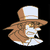
img299.imageshack.us/img299/6200/megamanjuno4om.gifFull scratch, aside from the face, which is an edit of Megaman's from MM7. My first actual shot with anything that isn't Kirby related. Speaking of which, I have more where this came from, but I'd like to see how the thread does first. So, uh, C&C would be appreciated!
|
|
|
|
Post by Santa Melty on Oct 1, 2005 21:55:43 GMT -5
Oh, not bad. You don’t see many Juno-related fan pieces for some reason. There are some small flaws. For example, the cheeks should be lower, and the arms much thicker. His smile was also very slight. The one you used makes it look like he’s lost his mind. o.o
The body also seems a little crooked. The curve of the left side of his armor is much more then that of the right. The system symbol was also much smaller with longer extensions.
Of course, the stuff with the face is very minor. Nothing wrong that couldn’t be fixed quickly enough. The shading is well placed, although it could be a little more extensive. You can barely make out the differences in shades on the smaller ones.
Looking at it a little closer, I also see that the hair on the right side of his head falls too far in. I believe it’s supposed to fall directly between the chest and arm areas, but you have it falling right onto the chest. You also forgot the hairline. His hair is pulled back, so as to reveal the hairline. Juno has no bangs.
Let’s see... eh... nothing else comes immediately to mind... the spikes protruding from the top of his arms were straight, I believe. You have them pointing inwards.
Overall, not bad, but it could be a little more accurate. You don't see many scratch jobs around here though, let alone Juno. It’s coming along well, just work at the details a little more.
|
|
|
|
Post by infinity on Oct 2, 2005 17:53:02 GMT -5
|
|
|
|
Post by Aim on Oct 2, 2005 18:01:19 GMT -5
Very nice spritemanship, especially from scratch. I have a hard time with completely scratch sprites.
Hrmm.. the change looks better, although if I were you, I'd keep the horizontal line and instead eliminate the side smirk (it's a little too indistinct to convert to sprite). Er, other than that, the arms may be thicker, but I'm not really sure about that because it's been a while since I played the 1st. It's good though.
|
|
|
|
Post by deekthepirate on Oct 29, 2005 10:38:16 GMT -5
Hrm, im having problems opening it, everytiem i try, it says Operation Timedout, Ohh well.
|
|