|
|
Post by Dashe on Jul 15, 2008 14:35:05 GMT -5
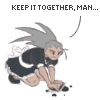
That'd make a funny joke picture. Add some dark circles under his eyes, prop him up against a brick wall in a sort of slumped-out pose, muttering something nonsensically philosophical with another robot master looking at him like he has three heads...just make sure you link to it with a warning that it contains drug abuse.  |
|
Glitcher
Zakobon
 Better than Mama!
Posts: 108
|
Post by Glitcher on Jul 15, 2008 17:14:43 GMT -5
As for the mask, I tried to make it a lot more rounded than the original...maybe that's what you're referring to? I can't find the problem(s) with the curves you speak of. :S EDIT: I looked at BubbleMan again in comparison to the other Powered Ups I did - are his lines really that bad? :S Lord, you make it sound like the whole picture is ruined. It's just that BubbleMan is seen at a level angle (well, maybe a slight overhead), so the curves on his mask should be prominently horizontal. Curving them upwards like that suggests we're looking up at him from below. If you really want to emphasize the roundness, draw the highest lines horizontal and the lowest ones curving downwards to fit the contour of his head. |
|
|
|
Post by Ageman20XX on Jul 16, 2008 0:12:02 GMT -5
As for the mask, I tried to make it a lot more rounded than the original...maybe that's what you're referring to? I can't find the problem(s) with the curves you speak of. :S EDIT: I looked at BubbleMan again in comparison to the other Powered Ups I did - are his lines really that bad? :S Lord, you make it sound like the whole picture is ruined. It's just that BubbleMan is seen at a level angle (well, maybe a slight overhead), so the curves on his mask should be prominently horizontal. Curving them upwards like that suggests we're looking up at him from below. If you really want to emphasize the roundness, draw the highest lines horizontal and the lowest ones curving downwards to fit the contour of his head. Before I edit the one posted on my site and the first post, I wanna make it's actually correct first, lol, so would you mind letting me know if this looks better, Glitcher? Too much? Not enough? Lol. I want it to be the best it can be because I really like the pose a lot, lol (and it took me a lot of work... >_<). Thanks, btw. -Age |
|
Glitcher
Zakobon
Better than Mama!
Posts: 108
|
Post by Glitcher on Jul 19, 2008 13:15:44 GMT -5
Before I edit the one posted on my site and the first post, I wanna make it's actually correct first, lol, so would you mind letting me know if this looks better, Glitcher? Uh... I don't notice any difference whatsoever. Are you sure you uploaded the right image? Anyway, when I said you should curve the lines of BubbleMan's mask downwards to match the shape and angle of his face, I meant it should look like the picture below. (I also put my signature on it because I'm better than you.  )  PS. Sorry for the late reply. My modem finally kicked the bucket. *sniff* |
|
|
|
Post by Ageman20XX on Jul 19, 2008 19:29:21 GMT -5
Before I edit the one posted on my site and the first post, I wanna make it's actually correct first, lol, so would you mind letting me know if this looks better, Glitcher? Uh... I don't notice any difference whatsoever. Are you sure you uploaded the right image? Anyway, when I said you should curve the lines of BubbleMan's mask downwards to match the shape and angle of his face, I meant it should look like the picture below. (I also put my signature on it because I'm better than you. ) img525.imageshack.us/img525/4223/bubblemanfy2.jpgPS. Sorry for the late reply. My modem finally kicked the bucket. *sniff* The image I linked and the image you linked look identical to me - I did exactly what you just did...so I'm gonna take it I did the right thing. Lol. No really - open up the link and compare it to yours, looks pretty near identical aside from size. Maybe I'm missing something? Anyway - late reply is cool. Sorry 'bout your modem!  -Age |
|
|
|
Post by mirak on Jul 19, 2008 23:35:23 GMT -5
Perfectionism is bad for your health, kids.
|
|
Glitcher
Zakobon
Better than Mama!
Posts: 108
|
Post by Glitcher on Jul 20, 2008 3:50:28 GMT -5
The image I linked and the image you linked look identical to me - I did exactly what you just did...so I'm gonna take it I did the right thing. There's obviously something amiss here. I'm telling you, the hi res image of BubbleMan you posted has his mask lines curved up, not down. Check it again; I'm certainly not seeing things. |
|
|
|
Post by Pitch on Jul 20, 2008 11:53:38 GMT -5
I think I get it now..
He means the lines on the mask, the part covering BubbleMan's mouth.. For some strange reason I thought he was talking about BubbleMan's goggles. Based on the filename of your adjusted file, I think you did too? (BubbbleMan_PoweredUp_GoggleAdjust_test.jpg)
It does seem to make more sense that way now that I see it..
|
|
|
|
Post by Ageman20XX on Jul 20, 2008 14:19:42 GMT -5
I think I get it now.. He means the lines on the mask, the part covering BubbleMan's mouth.. For some strange reason I thought he was talking about BubbleMan's goggles. Based on the filename of your adjusted file, I think you did too? (BubbbleMan_PoweredUp_GoggleAdjust_test.jpg) It does seem to make more sense that way now that I see it.. Yeah, I totally didn't see it until you just said that. The mouth parts. I see it now, Glitcher. Lol. Sorry I didn't understand - I thought you meant the goggles. >_< Now that I can see what you did though, it makes total sense and I'll get on fixing that as soon as I can. -Age |
|
|
|
Post by Ageman20XX on Apr 12, 2009 22:55:35 GMT -5
Greetings! I've been nine long months since my last post in this topic but instead of making a new post I felt it would be best to just revive this one - I mean, it has a history. While I still haven't done any actual new Powered Ups yet (I've been very busy with my website), I did manage to "revise" a few of the old ones. As with anything you draw, you can grow to dislike it in time. You find flaws, things you wish you'd done differently, etc. Well, I decided to redo certain parts of old Powered Ups my modifying them in various ways. Shading, lineart, colours, proportions, pose, and sometimes entire body parts have updated or changed all together. Lol. I've listed the ones that went through the most dramatic changes with the cast of MegaMan 2 being the most obvious (and best) ones in my opinion. Check the first post as well as I've updated a few of older ones not listed here as well as links to the artwork's respective pages on my site. Why does this matter? Well, aside from being my awesome new site and being easier to browse, there is also this functionality now called "Attachments" and you'll notice that a lot of the Powered Ups have at least 1 or 2 of them. These can be anything from past revisions to original pencil sketches to zoom-able SWF vector files so I highly suggest checking them out. ---       WoodMan Powered Up WoodMan Powered Up : The first Powered-Up that started them all, WoodMan still holds a special place in my heart. I love the way his design turned out and his colours, but my inexperience with the new lineart shows. QuickMan Powered Up : After going through many revisions, QuickMan finally looks a bit more like he's supposed to. Complete with cute blue eyes and a devilish grin this revision looks far better than the original. AirMan Powered Up : While the original barely looks like AirMan other than the fan, I think this new revision makes him a lot more akin to his true, angry, unbeatable persona that we all know and love. CrashManPowered Up : CrashMan went through quite a few changes from his original version as well. Not only in proportions and lineart, but in colour and pose as well. I love the look in his eyes! FlashMan Powered Up : Without a doubt my absolute favorite of the revisions, I feel I finally captured what makes FlashMan so awesome. That new look, the eye colour, the face and head shape, and the pose all make him come to life now. His original version looked too...odd. Like a kitty or something. This one's much better. BubbbleMan Powered Up : The adorable, plucky BubbleMan redone in Powered Up style! One of my better Powered Ups , I really like the way his linework turned out as well as his big, blue, goofy eyes. ^_^ After some major revisions thanks to the suggestions of people like Glitcher and my boyfriend, BubbleMan is probably one of my best pieces now. So yeah guys, let me know what you think! I worked really hard on these and I hope you guys like 'em. -Age |
|
Glitcher
Zakobon
Better than Mama!
Posts: 108
|
Post by Glitcher on Apr 25, 2009 6:03:00 GMT -5
After some major revisions thanks to the suggestions of people like Glitcher and my boyfriend Wait a minute... you're a girl? So that's what I've been getting wrong all these years. The name "Ageman20XX" is kinda misleading.  Anyone who pours this much effort into revising their illustrations must have a real love for their work, which is nice when I see so many people become bored or frustrated with their drawings and leave them unpolished. The updates are much smoother than the originals, but in all honesty I think I prefer the old Air Man to the new one. I remember when you submitted it to MMN (the old version of the site), and I was just so impressed with the way you captured the soft, cutesy look of the style that I saved the image to disk, which is something I rarely so with fan art. The meaner eyes are probably truer to form, but Air Man doesn't seem as lovable any more. And besides, you overlooked the eyebrows, which are still arched up when they should be in a frown to complete the expression. But even if you still prefer this version, I'm confident you have the devotion to fix the problem. |
|
|
|
Post by in·clover on Apr 25, 2009 12:44:25 GMT -5
 I'm a little late here I guess. I love 'em. And I don't even really like powered up. Of the new ones, I think I like Woodman and Quickman the best. I love the way you did Crashman in that pose, but his face looks really wonky to me. After some major revisions thanks to the suggestions of people like Glitcher and my boyfriend Wait a minute... you're a girl? So that's what I've been getting wrong all these years. The name "Ageman20XX" is kinda misleading. Glitcher, not everyone is hetero. 
|
|
Frankenpetey
Gorubeshu
Official MMLS Genre Sage
"It's for the family!"
Posts: 220
|
Post by Frankenpetey on Apr 25, 2009 13:08:32 GMT -5
Ugh, how do I always miss the good threads? >[ The website's going to take me a while to poke through (not that that's a bad thing), but from what I've seen so far BubbleMan is my favorite piece, and not just because I've got a soft spot for the little guy. It looks very professional. I like the expression and the perspective of the near drill-arm on CrashMan, too. Even though I can't look at CrashMan anymore without the Hyadain song getting stuck in my headGlitcher: Comrade, there's a little severed MegaMan head under Ageman20XX's icon, not a little severed Roll head. But irrelevant gender/orientation is irrelevant. |
|
|
|
Post by Ageman20XX on May 13, 2009 21:07:34 GMT -5
After some major revisions thanks to the suggestions of people like Glitcher and my boyfriend Wait a minute... you're a girl? So that's what I've been getting wrong all these years. The name "Ageman20XX" is kinda misleading. Glitcher, not everyone is hetero. Glitcher: Comrade, there's a little severed MegaMan head under Ageman20XX's icon, not a little severed Roll head. But irrelevant gender/orientation is irrelevant. Lmao - so much drama over my gender! I am indeed a boy - just of the more... man-loving persuasion. Haha. "Ageman" is totally a man. Anyone who pours this much effort into revising their illustrations must have a real love for their work, which is nice when I see so many people become bored or frustrated with their drawings and leave them unpolished. The updates are much smoother than the originals, but in all honesty I think I prefer the old Air Man to the new one. I remember when you submitted it to MMN (the old version of the site), and I was just so impressed with the way you captured the soft, cutesy look of the style that I saved the image to disk, which is something I rarely so with fan art. The meaner eyes are probably truer to form, but Air Man doesn't seem as lovable any more. And besides, you overlooked the eyebrows, which are still arched up when they should be in a frown to complete the expression. But even if you still prefer this version, I'm confident you have the devotion to fix the problem. I totally did forget his eyebrows! And you know me - I'm probably gonna fix that up at some point. Haha. I guess I did sacrifice a lot of the "cute" factor, unfortunately. Well, there's always next time - I sincerely doubt these'll be my last Powered-Up pieces.  And thank you very much to B-R-E-T and Frankenpetey too! I think you'll be happy to know, Frankenpetey, that it was listening to Hyadain's stuff that inspired me to come back to these and update 'em. I love his shit to death. Haha. -Age |
|
|
|
Post by Blues on May 14, 2009 15:32:11 GMT -5
I like how 'so much drama' on Legends-Station is all of two posts. This board is so relaxed that's all it takes- no problem here. So, are there plans for more "Powered-Up" style Robot Masters? It'd be cool to see what the Mega Man 9 RMs would look like. |
|