|
|
Post by Dashe on Sept 5, 2008 17:11:50 GMT -5
Petey's right. I haven't posted much art or really much of anything in a long while...partly because I haven't had a scanner in that long, and partly because my heart just isn't in drawing Legends stuff anymore. Even though I have absolutely no idea who any of the people in any of the sketches are, they are highly amusing to look at, and by amusing I mean in a good way, not in a "so lousy they're funny" way.
And you never know. True genius can come from a scan of a church bulletin doodle with the proper attention and modifications, especially if you've accidentally left part of a snippet about the bake sale next saturday in the church lower hall. Those always add a little oomph to the composition in my humble opinion. Besides, to someone who can't draw at all, even your scrap work probably looks amazing.
Though I've been noticing that a lot of it seems to slant over to the right as you go down the figure. You right-handed or left-handed? I'm a righty and I've been having that problem lately.
|
|
|
|
Post by Santa Melty on Sept 5, 2008 23:57:46 GMT -5
 She has underpants on her head. ... But underpants are worn on the bottom. So logically, the head must be the bottom... Which would make the bottom the head... and... err...  *snaps fingers* Ha! Clearly, the underpants are being worn in a perfectly ordinary fashion. There is no problem with them. However, I should point out that the picture was drawn upside-down and that her bum has ears. *strokes chin logically* Haven’t posted here in a while... and alas, I’m afraid I can’t think of many specific things to point out at the moment. Generally though, it looks like your improving. There are definitely more lower-body shots around than I remember there being back in the day, which is good, and expressions continue to get more varied and creative. I like seeing the experimentation; tis the fun thing about sketches. At least for me. I agree with Petey that they are quite worth looking at. o.o In particular, I like the amount of detail you seem to put into drawing the mouths. You’ve got some good lips mixed in there, and the way you vary the thickness of the lines makes for a nice effect. That girl in the third image down especially caught my eye. As for critique... It’s a little harder to come up with stuff after making room for personal style and the fact that these were just doodles, though I do see some distracting anatomical stuff persisting through many of the sketches. I won’t comment on the lovecraftian horror that is female anatomy (I’ve been trying it recently, and I know it be painful, grisly stuff. I probably couldn’t offer anything useful on it if I wanted to), though I do think something looks wrong with many of your eyes. Even with perspective and the expression taken into consideration, it seems like the one eye is always too small or too large on the vertical (though their horizontal proportion/positioning looks about right). I think detailing them a little more could help as well (adding a line for the lower lid, making the curve of the eye under the upper lid more distinguished, etc.), since the eyes play such a large role in creating expressions. You can make some pretty interesting faces by playing more with such things as the angle of the lower lid and the position/size of the pupils. It doesn't seem like you've fully explored the possibilities yet, and I think it could only help to enhance the expressiveness of your characters as they are now. The chin doesn’t always look like it lines up properly with the center of the face on the quarter-turned heads... Though it might just be me. The posture on the full-bodied characters seems slightly off... some of them may be leaning a bit too far backwards, or their legs aren’t angled properly to support the weight. This is sort of along the same lines as that thing Dashe pointed out with the rightward slant. Though that could be chalked up to the angle that the images were scanned at or the fact that the legs aren’t always entirely visible... Either way, something is off there. Then there’s stuff like hands and foreshortening, though I personally don’t know anyone who can get that right consistently. It looks like you’ve got the general shape of the legs and arms down, though the positioning of the elbow and other joints seems off at times (underpants girl and that woman in the first sketch both look like they have abnormally high elbows, for example). And... that’s all I got for now. Keep working at it; you’re bound to continue improving. Also, YES to Phantom Brave fanart. Now, as for the matter of you having left... Honestly, I never even considered you to be gone. More like... on hiatus, at worst. It didn’t feel like you left. Became a bit less active perhaps, but it happens to us all eventually. o.o As to the old days and the nature of the artwork that you have been doing, I agree with Petey and Dashe. You have no obligation to us to invest hours into a “polished” piece to post, or to put effort into Legends artwork that you simply don’t have the heart to do. The old days were definitely fun, but I believe they were so for the very reason that we were all drawing according to what inspired us; at the time, this just happened to be the Legends series. Without that inspiration, it simply wouldn’t be the same. In my experience, drawing out of a sense of obligation is just never as fun, so draw what it occurs to you to draw at the time. Then, when you feel like doing Legends stuff, do Legends stuff. *shrugs* And I throw in that shrug because I am trying desperately not to sound preachy. I doubt it is working.  Do I at least look nonchalant? In any case, you’re certainly still welcomed to converse and post art around here. It almost seems like you feel otherwise at times. *shrugs* Lastly, don’t remind me about commenting in other people’s art topics. I’m pretty much in the same boat as you with that as of late.  |
|
|
|
Post by mybusterbroke on Sept 7, 2008 17:56:11 GMT -5
Wow these are really good keep em up!!
Nice girl there with the shiny eyeballz
|
|
|
|
Post by Aim on Sept 26, 2008 0:19:52 GMT -5
|
|
GSG
Cannam
  o_e
o_e
Posts: 331
|
Post by GSG on Sept 26, 2008 20:02:14 GMT -5
N-N-N-N-N-N-N-N-N-NOSEBLEED! Aim, never be ashamed to scan quick stuff. Sure as hell I prefer quantity over quality any day of the week - although, with stuff like yours, even quick doodles don't suffer in quality. It's such a shame when people have awesome ideas and fleeting fancies for artwork, but feel so pressurized to produce a polished piece* that they never materialize. So, please, keep updating! Also, you shame me. I haven't been doodling nearly enough Glyde and Teisel recently.  I simply refuse to draw Loathe, though. He reminds me of a root vegetable. *Shudders* *ALLITERATION COMBO! STAR POWER!! |
|
Frankenpetey
Gorubeshu
  Official MMLS Genre Sage
"It's for the family!"
Posts: 220
|
Post by Frankenpetey on Sept 28, 2008 12:13:15 GMT -5
Hey, root vegatables need love too, ya' know! And no one captures the essential Loathiness quite like you do, Aim. I heartily approve.
As to the rest of the update, all I can say is: nice work not making them look like pillows. Even without the blackout box I don't think it would have been too bad, but better safe than sorry. :B
|
|
|
|
Post by Aim on Sept 30, 2008 23:57:48 GMT -5
Thanks for your comments, guys. It makes me especially happy to see Gesselshaft Gal here swooning for Glyde. Good times, good times. Drawing Loathe is fun under any circumstances.
Alas, I actually don't have anything else to share right now, I just wanted to let you guys know I was watching and thankful for them. XD
|
|
|
|
Post by in·clover on Oct 4, 2008 3:46:17 GMT -5
It's great to see more of your stuff after such a long hiatus. I was beginning to think I may never see more legends art from ya' again.  I don't think I've ever seen a picture of Glyde with both eyes uncovered. And for an oekaki, that's some damn good lighting. Not sure there's a word for it, but with the light source coming from underneath, it makes them look especially evil.  |
|
|
|
Post by Santa Melty on Oct 15, 2008 22:41:22 GMT -5
... Derr...  ; *makes half-hearted attempt to navigate own thought process* ... Well, I figure... Hmm... ... Well... Generally, when I’m making a post in an art thread, things tend to start off quite civilly. My intention is to provide at least some form of criticism to the person in question (more or less depending on how much time I have available to me), and I’m optimistic that I can be of help in some way. I guess you could call this stage one of my commenting process. Stage two comes after this, where I actually begin looking through posted work for specific aspects that I feel could be improved on or that otherwise seem to have potential for interesting commentary. It’s at this point that I begin jotting down some notes. Of course, in the interest of being brief, I make an attempt to only pick out the most pertinent errors to comment on. I think the problem begins around here somewhere, when I notice that the kinds of errors present in one image are not necessarily evident in others, or when I start taking style into account and begin wondering if the particular error I’m looking at was in fact intentional rather than an oversight of some kind. This brings what is or is not pertinent into question, and I start wondering whether or not a particular statement is really necessary at all or if by posting a certain thought I would be infringing on some kind of creative effort on the part of the artist that I have simply failed to grasp. Then I get to arguing with myself over whether or not a particular blot of color was put there to fill space or balance the image or if the blot is in fact just a thick line masquerading as a blot. Then I figure out it’s just a smear on my monitor and I realize it’s eleven at night and I go through this whole meaning of life thing, then move on to the next image the person posted, and it really gets to be a pretty bad mental mess. This normally ends up culminating in a great “Sod this, I’m just posting everything I’ve got up and letting those bums sort through it, ah ha ha,” in so many words. At this point, I’ve reached the third stage, which tends to be characterized by flying bits of hardware and a lot of cream soda. But that won’t happen this time, because I’ve already spent too much time musing over the above answer and I’m out of soda.  As for the sketches/oekaki, not bad work. Most of my previous comments will still apply, I think (heck if I can remember everything I’ve posted). And I’m agreeing with Petey on the girl. o.o In fact, I’ll agree with Gesselshaftgal, Petey, and In-Clover on just about everything, including the part about root vegetables. I think the Loath/Glyde image could have had a little darker shadows, but that’s about all I’ve to add, I think. |
|
|
|
Post by Aim on Oct 28, 2008 2:01:46 GMT -5
|
|
Frankenpetey
Gorubeshu
  Official MMLS Genre Sage
"It's for the family!"
Posts: 220
|
Post by Frankenpetey on Nov 2, 2008 14:01:12 GMT -5
I don't know, without the jitter lines, the nervous guy wouldn't look too over-the-top to me. Portraits really are your strong suit, you have a very good grasp on expressions.  |
|
|
|
Post by in·clover on Nov 2, 2008 14:19:03 GMT -5
Sweet. Somehow I didn't see these before.
The jittery ski cap guy and the unsure-looking native girl are my fave of the bunch, even if the ski cap is sort of resting on top of his head instead being pulled down. Your expressions go beyond simple happy/sad/angry and delve into more complex moods that really have no definitive qualities. I like that.
Are these role playing characters of yours? Or just OCs? Those outfit designs are pretty wicked.
|
|
|
|
Post by Aim on Nov 3, 2008 12:03:59 GMT -5
Well, if you don't recognize any character in this thread, there's a good chance that the character is either my roleplay character or someone else's. Roleplaying with original characters makes up the better part of what I do on the net nowadays. XD The uniform there is taken from Mana Khemia, and the characters wearing that uniform are from Vell Fors Academy, an RP site based on Mana Khemia very loosely. I'd encourage anybody who likes RPing to join, even if you're not familiar with the series (nobody there besides Heat and I is familiar with it). And I like my portraits, but then, I do way too many of them. I tried over the weekend to practice some muscle detail and posing, but eh, I just ended up realizing that I'm woefully unsure of proper arm length. I'll keep practicing though. 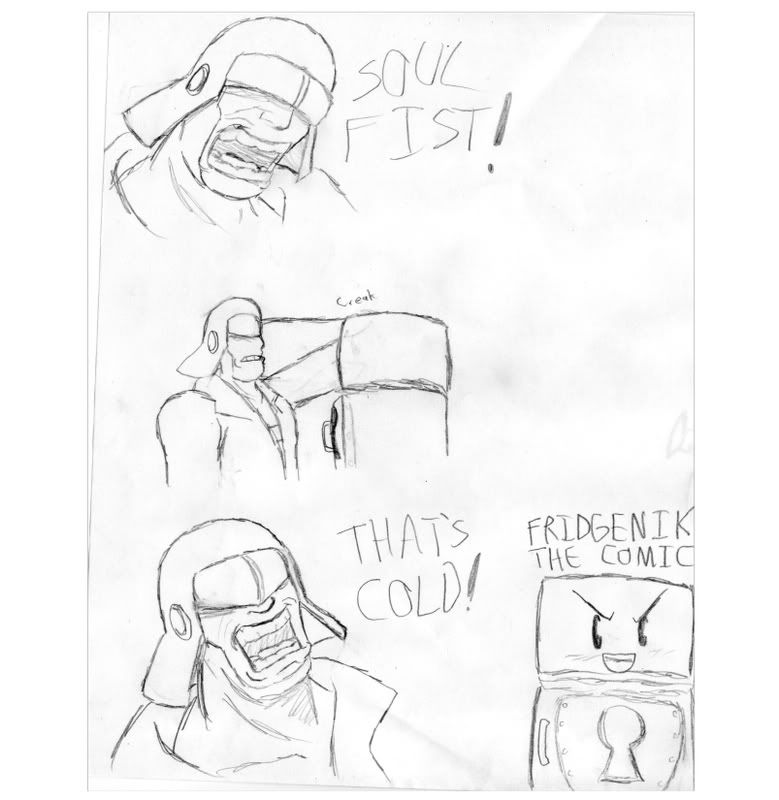 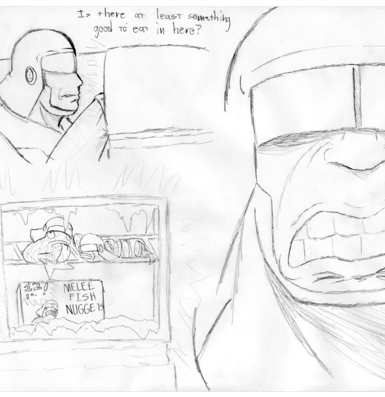 They aren't very well drawn, but they're something to post, anyways. I guess nobody will really understand the jokes, but they're kind of inside. |
|
|
|
Post by in·clover on Nov 8, 2008 15:44:57 GMT -5
Did he just punch through the fridge...?  I have never seen such exaggerated manliness in someone going about their daily routines like that.  Just out of curiosity, have you tried using comic tones in photoshop? |
|
|
|
Post by Aim on Nov 17, 2008 21:06:27 GMT -5
Huh, not sure. That wouldn't be a bad idea at all though. I need to stop being lazy and 'shop my stuff after I'm done with it. 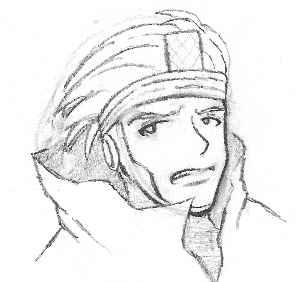 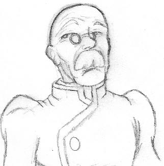 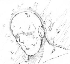 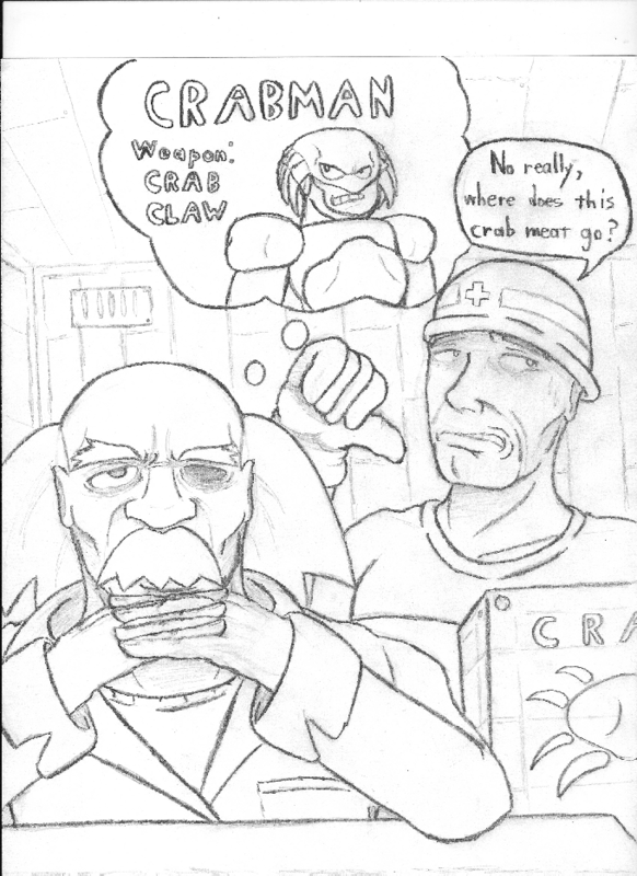 A fun MML gag pic. It's been a while. XD The crate-lifter's nose is to far down, I think, which upset it and caused me to off balance his eyes. I think the nose should be farther up, at least. |
|