|
|
Post by aarond on Mar 5, 2006 1:47:12 GMT -5
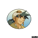
Yeah, I think the font looks okay. What would have been funnier is if you mostly saw the top of MegaMan's helmet or something, as that seems to be the focus in 2's box art. Or maybe, just his arm or something, with a generic background. Uhhh. The US boxart is awful.
|
|
Shift
Sharukurusu
 Blade Arm Master
Anchored Cross
Blade Arm Master
Anchored Cross
Posts: 668
|
Post by Shift on Mar 5, 2006 2:08:09 GMT -5
It's actually not a font. I had to trace the Megaman Legends letters from the second box art, then draw out my own 3, using another font as a basis. As for CoA's box art, duh. It's America. America has this sort of obsession with taking good things and ruining them. Whether it be Naruto the anime, or Dark Cloud 2 the game, they manage to make things worst, whether it be completely or just a little.
|
|
|
|
Post by Dashe on Mar 5, 2006 12:58:17 GMT -5
Thanks a buch, Shift...ooooh, this is gonna be soooooooo good... >  And...my printer's out of ink. Greeeeeaaaat. Well, I've still got a while before April 1. Might as well use the time to make my "Preview" as realistic-looking as I can. |
|
Shift
Sharukurusu
Blade Arm Master
Anchored Cross
Posts: 668
|
Post by Shift on Mar 5, 2006 13:51:15 GMT -5
Try dumbing down the quality of it, that might work. I'll try altering the gradient that I used for the logo a bit, as it seems too... Microsoft Powerpoint XP ... I fixed the Capcom logo a bit, as it had weird white lines going on around the edges, and as for the PlayStation logo in the top left, that white border seems to stay the same thickness, no matter what I set it to. I might just remove it all together...
|
|
|
|
Post by Fire Griffin on Mar 5, 2006 17:03:56 GMT -5
I think you added too much gradient to the title. I'd lighten the blue a bit so it won't look like the letters have some kind of stripe pattern theme going on.
|
|
|
|
Post by Dashe on Mar 5, 2006 18:58:50 GMT -5
Maybe you can alter the PS logo in MS Paint or Photoshop or something, and then copy and paste it onto the design. Or give it a grayish sort of tint to make it seem a bit less bold.
|
|
|
|
Post by jargus on Mar 10, 2006 17:42:26 GMT -5
Nice
|
|
|
|
Post by legendsmaster on Sept 2, 2007 23:11:42 GMT -5
if i didnt know any better i would think it wuz the real deal.
|
|
|
|
Post by Dragge on Sept 3, 2007 10:37:24 GMT -5
That is pretty amazing. I just found the thread today and love it! I should do what Dashe did and fool a friend!!!  Edit- What would the back cover say? "Play the sequal of the sequal of a wicked game that doesn't exist. Play as your favorite character once again in the quest to get Mega Man Legends producer Inafune as much money as possible to create the sequal." Am I right or what? |
|