|
|
Post by Aim on Oct 20, 2006 15:45:29 GMT -5
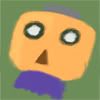
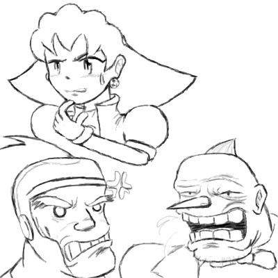
Haven't updated in over... Two months, eh?  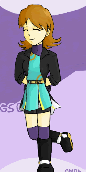 Gesselschaft Gal's art trade. Fun fun. Head looks much better on a sketch I have lying around my room... I should scan it. Lots of discoloration too, sorry about that...  TriggerMan, DimensionMan, and Ookami from a Battle Network RP. *eats matches and dynamite until he's so full he explodes* |
|
|
|
Post by Dashe on Oct 21, 2006 0:34:52 GMT -5
Yay!!! New stuff from Aimman! I don't really understand this batch though...who'd GSG draw? I can't recognize the character. Maybe because right now it's 1:30 in the morning...the arms look kind of weird on the three BN RP guys, and the first and last guys' legs look kind of funny but again, it is 1:30 AM. I need to get some sleep.
|
|
|
|
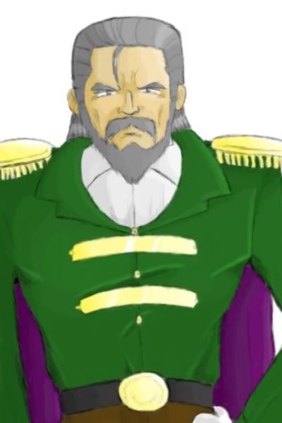
Post by Aim on Nov 6, 2006 8:42:41 GMT -5
 Rather unsuccessful sketches of random characters. Bah, just feeling doodly. On another note... i23.photobucket.com/albums/b367/AimManEXE/tron.gifJust going to put a link to that one. It relates to the scene in the Saul Kada ruins, if you catch my drift....  |
|
Four
Gorubeshu
 "Who ate my crackerrrs..."
Posts: 236
|
Post by Four on Nov 6, 2006 18:09:10 GMT -5
OF CORS I HAVE TEH HYPER SHELLZ!  Nice, nice sketchies there Aimman. They do in fact look like Tron Teisel and Loathe, so I'd say it's pretty successful  . Heheheh, and the Saul Kada ruins one is pretty... uhm... expressive XD. Nice job shading Tron's hair there by the way. |
|
|
|
Post by Aim on Nov 18, 2006 18:14:16 GMT -5
|
|
|
|
Post by Musashi on Nov 18, 2006 19:00:37 GMT -5
Wow! That has to be the best face you've drawn and I've seen in awhile! Very nice clothes folds too, you've really improved.
|
|
|
|
Post by Aim on Jan 6, 2007 16:35:15 GMT -5
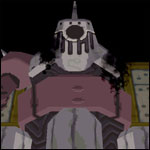
Thank you Mr. Triggerov D. System. =D Additionally, here's another animation I just completed. This one's of my navi, DimensionMan. The only strange thing is, it's a YTMND. O.o dimensionmobile.ytmnd.com/------ What's AimMan got? Well, just a bit of this and that... What if I told you I had fighting nuns and evil alter egos? That's right. Fresh off the black market, like always- I mean, from a completely reliable, legal source.  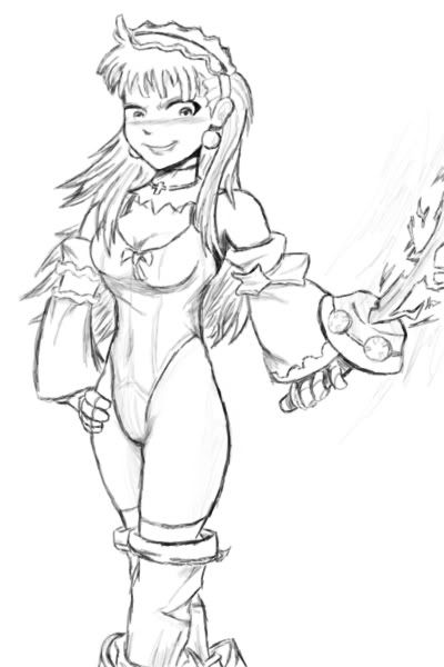 Princess Eclair's alter ego, who wears skimpy clothing and carries around a lance that turns into lightning.  ; 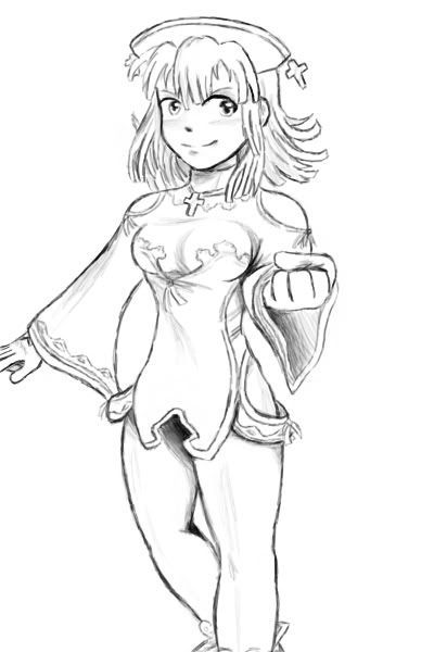 Prier, the hero of La Pucelle: Tactics. She's gonna be da maiden of light! 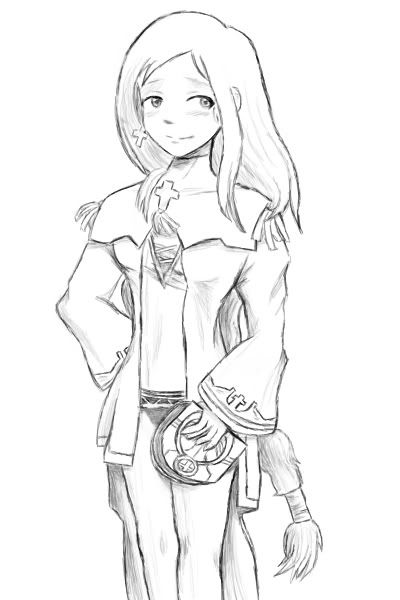 Alouette, another main character in La Pucelle: Tactics. Yeah, just kidding earlier. She's really going to be the maiden of light. |
|
|
|
Post by Musashi on Jan 6, 2007 18:59:18 GMT -5
Jeez, you just keep getting better and better... |
|
|
|
Post by Dashe on Jan 6, 2007 23:51:04 GMT -5
Did I ever mention I love La Pucelle: Tactics? Your work's definitely improved since you got here, Aim. One thing I did notice, however, is that the hands on all the characters look a bit awkward, especially Alt. Eclair's sword hand. Hands (feet too) are a pain in the butt to draw, believe me, I know. The foreshortening on Prier's arm seems a bit off to me too, and her legs look...well, a little fat, to be completely honest. Otherwise, I think they look great! Keep it up!  |
|
|
|
Post by Bureaucratic Model 1-3 on Jan 7, 2007 0:50:01 GMT -5
Hmmm... to think I haven't noticed this thread up to this point...
Yes, Aimman, I would have to say that line art TKA (totally kicks aramadillo). In fact it's almost as good as some japanese pro's I stumbled upon, mostly in sPri searches, thought nobody here would even know what that was.
Since you're good at code you should try something a lot of them do, baku block. If you don't know what that is I'll PM you, but definitly think about it before you paint those things.
By the way, do you do comissions? Like have you ever played Tales of Symphonia? If not I could Fed-ex you my copy so you could play in exchange for some character art. Someday, when I have money, I'm probably going to commision more art than than any other man alive, other than popo jojo (how I hate him). Think about it, it's actually a great game.
And just so we're clear you would have to mail the game back someday.
|
|
|
|
Post by Aim on Jan 7, 2007 22:22:21 GMT -5
To the Colonel: Thank ye. To the Dashe: Hands are still awkward, yeah. Big check on that. Foreshortened arm should be farther to left, true, since you can see that the sleeve doesn't line up as it comes from the right. However... 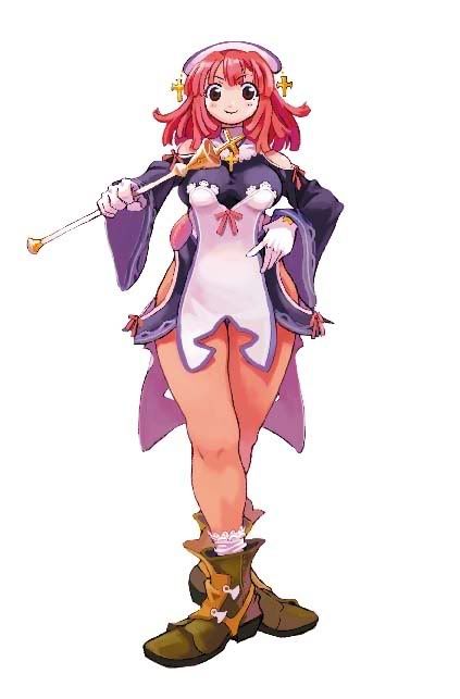 Prier has fat legs. I underexaggerated, if anything.  Anyways, thanks for your commentary. To the... BM 1-3: Baku block you say? Is that where you block a giant dog monster from trampling over you? I don't quite recall painting that. Might want to PM me there. And yes, I'll consider requests if you want to give them. Never actually done a commission though. |
|
|
|
Post by Dashe on Jan 8, 2007 17:11:35 GMT -5
Oh yeah...since the whole game's pretty much sprite work, I never noticed. Now I see what you mean...
|
|
|
|
Post by Santa Melty on Jan 15, 2007 23:24:19 GMT -5
Muscular legs, sir. Prier has muscular legs.
I see I’m a little late, but I haven’t commented for pages, so I’d have been late anyway.
So, browsing through everything (by which I mean only the stuff posted on this thread), I agree that you have improved since you began here. Mainly in the areas of lines and... clothing, actually. Compared to your earlier drawings, your later ones seem to have much more logic in their folds. The lines are also more refined. A long time ago, I also made a remark about you being good with faces but not doing much with bodies, though it looks like you’ve branched out a bit since then.
Speaking of which, it also looks like you’ve gotten better at anatomy. Most of the problems I see in many of the earlier images (leading right up to that last one of Tron, in fact) involve arms bending where they aught not to bend. A lot of your elbows look much higher than they should be, though the length usually looks natural enough. But looking at the recent La Pucelle art, you seem to have remedied that.
Hands, though, need work. Cartoonish-looking hands aren’t a crime, but your hands seem inconsistent enough to make me think that it is a mistake rather than a design you chose on purpose. But either way.
Your perspective doesn’t always look entirely convincing, though I think the foreshortening on Prier was done very nicely. Actually, you seem to have a fairly good record with foreshortening, looking back on things... I think it may have been that drawing to GSG that put the perspective issue into mind. That one leg...
Ah, and the lightning on the sword looks strange, but I guess that would be difficult to portray correctly without color.
Your coloring style seems to have changed a bit since the earlier days of this thread. Perhaps you’re using a different program now? Personally, I liked the coloring you did on the Yuna and Sera ones more than the coloring on, say, GSG’s character or Diveman from the previous page. But that’s just me. Overall, the coloring has been pretty good. The coloring on Crush Clawfish Girl had a very submerged feel to it, for example. Of course, this is under the assumption she was supposed to be underwater, but I’ll give you the benefit of the doubt. However, it can be rather hard at times to differentiate between organic and metallic materials... but then, a lot of the stuff here looks like it could go either way, so I guess I can’t fault you on that. Again with the beneficiation of the doubting. Dekkergard’s shirt straps do look distinctly metal though.
I do like the sketch look you’ve given many of your drawings. A lot of them manage to retain a very natural feel to them. You use a tablet, yes? Shading on the recent black-and-white drawings are also good.
Let’s see... for other things to work on, perhaps flowing clothing, such as capes and loose jackets. I site: the bottom of that shirt Alouette is wearing, and Triggerman’s cape. Hair also does look odd at times, especially when you make it rest over the shoulder. Somehow, it looks... stringy. Or snaky. I don’t have an adjective dictionary on me, so I’ll just pray you know what I’m talking about. Éclair’s hair looks good though. It’s split end haven, but it suits her. It also has a nice flow to it.
Anyway, tut tut, zounds, keep it up and so forth. Overall, the lines, shading, and composition in general is quite good. I’d say most of the work needs to go into anatomy, and perhaps more elaborate poses. There doesn’t seem to be a lot of background scenes either, so that might be a good direction to head as well.
Also, if BM1-3 does actually tell you about Baku Blocks... please do tell me about them some time. I’m curious now.
|
|
|
|
Post by Aim on Mar 2, 2007 23:48:16 GMT -5
Wow. Thanks for the biiiiiiiiiiiig ol' comment mlt. Let's see how much of it I can respond to before art class. The color is something I'd been meaning to discuss; I haven't really had time to get back on and do an oekaki, which is the key to my successful coloring. The coloring on Dekkerguard or GSG's request, for instance, was done in Procreate, a program that came with my tablet. So yeah, in order to do superb coloring, I'm going to need to get back on to the oekaki board and sit down with the thing. I'd like to develop my technique with the old trusty watercolor tool a bit more, the one I used for the Yuna and Sera pictures and what not. Hands do need to be better, yes. They always seem to be in need. Arms too, in general. I seem to do bodies pretty well on muscular or glamorous characters; I still need a lot of work drawing people with skinny or plain structures. I still can't do muscular arms though, just main bodies... Yes, sketchy style comes from doing black and white Procreate Painter drawings with my tablet pen. It seems to me, though, that it's something my brother's been doing for quite a while but I just got the hang of. And I'll be sure to keep your advice in mind as to what I need to work on next. Posing's still troublesome as ever, of course...
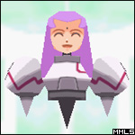
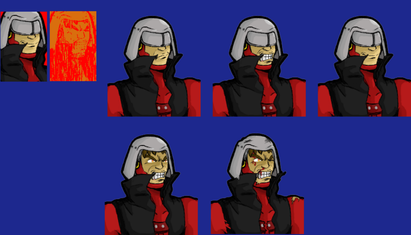 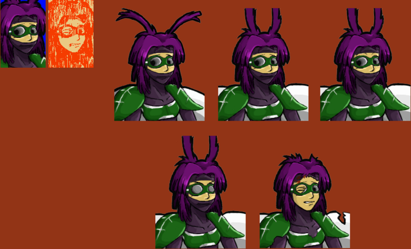 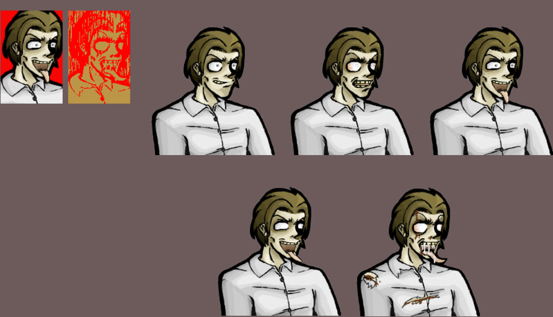 Two fun groupings of mugshots for MeleeMan and Fly, two random original characters. MeleeMan is my new navi over at a Megaman Battle Network RP, but Fly's just kind of out of left field. EDIT: Bradock Colley added. |
|
|
|
Post by Aim on Jul 3, 2007 23:32:54 GMT -5
 Freudians! Ignore the fact that there's a giant screw in the background! MML Fans! Ignore the fact that Tron was nowhere near the Marwolfe's destruction! Critics! Ignore the fact that Tron's arm is too far off to the side! But yeah, this happens when I go into a picture with no real inspiration, I guess. Now that I've finished it I have all sorts of ideas for a gag picture or nice cute pic... |
|